Sales Tile | Carousel
Mobile Banking U.S. Bank
Opportunity for improvements
The accounts dashboard for the customer-facing Banking App is underutilizing prime real state where advertising offers on their “Sales Tile / Carousel“.
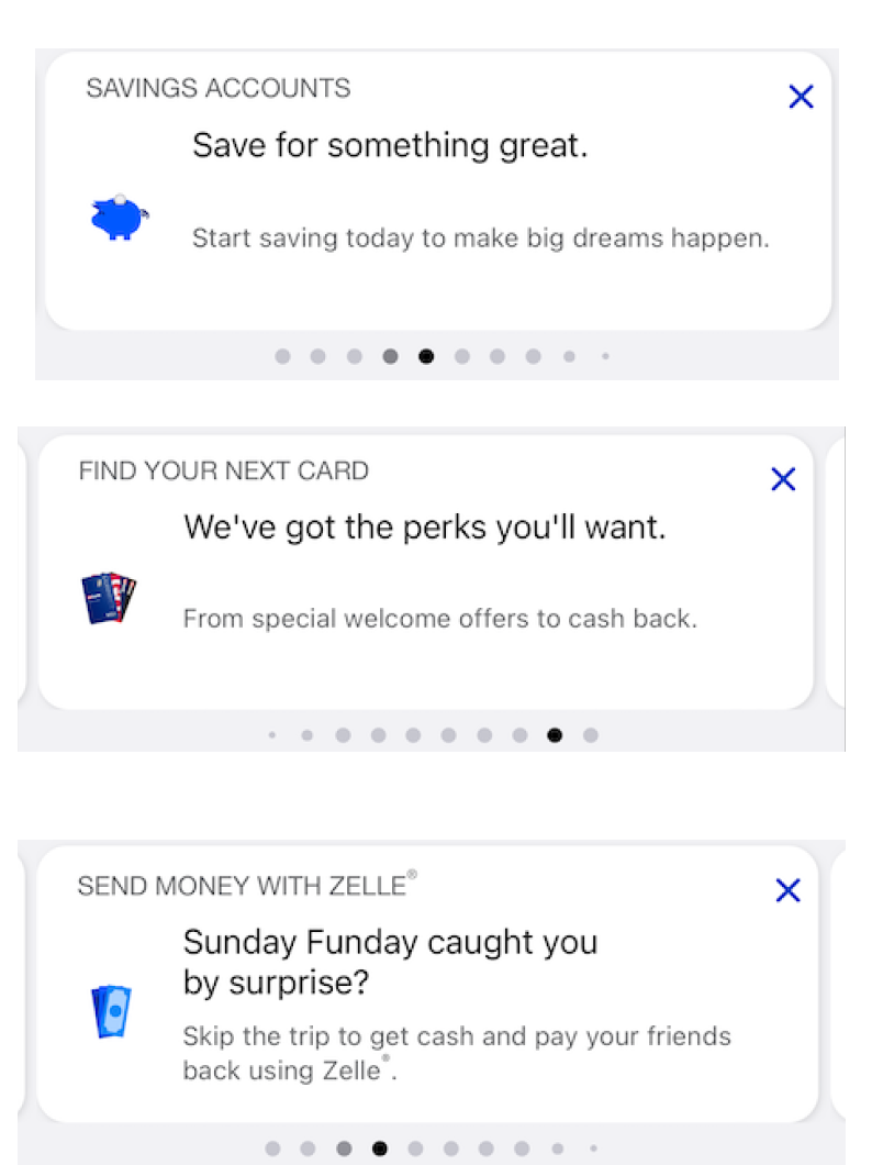
Cards before redesign (Screenshots)
Goals (Growth):
To come up with a playbook whether the ad placements and interactions planned are working correctly with the guidelines we are designing and planning to implement.
Drive the cadence of sharing and requesting permissions to me / team (present and distribute) for a large number of audiences who will be asking permissions to my team.
Business:
To increase engagement by 0.3%
Increase digital active users above 5.3 Million
Have customers enter from the dashboard and access prominent offers by tapping or swiping on the Sales Carousel to explore offers.
Available insights
- Issues addressed via data & research
Users were unclear about the offer value sales offers.
Users were not interacting with additional offers available within the same tappable area (not swiping left to access more cards).
There isn’t data tracking to the access to the offers.
Lacking strategy for offers. (Multiple teams add similar offers to this area)
Lack of content guidelines - Marketing teams are placing content “to fit the space“ instead of “what is easy and quick to understand“ to the user
At time of viewing:
- Digital active users (~5.3 Million)
- Average tap/swipe rate keeps on ~1.2%.
Key Optimization Details
I made the following series of modifications in order to achieve the desired business goals:
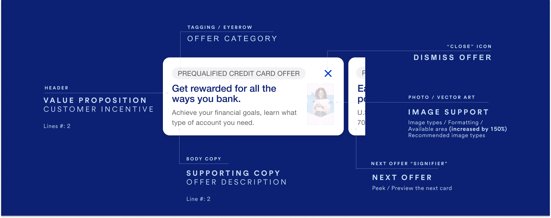
Content hierarchy - increasing relevance for what’s important (ie: eyebrow from header)
Content optimization - Leverage Ai to improve and target content to different audiences
Clarity of offers - Content Strategy Guidelines - for usage of eyebrow|callout - Header and body copy
Work with non-NBA (sales) content (Insights, feature awareness, financial education, etc)Next card visibility - reducing width of card to allow for next card visibility
Increase tile height without sacrificing significant copy content
Image support (150% increase) - Swapping location to the right to use the space naturally formed at the end of paragraphs surrounding text
Break the left aligned pattern to stand out between from the accounts’ icons
or alternately scale to work without graphic support if neededCharacter count - With support for Spanish translations
Future versions include a way for users to Visualize user’s engagement with sales tile (ellipsis/save icons)
After optimization - Guidelines provided to teams using the Sales Card template
Goals achieved post implementation:
Aligned workflows for several teams, Marketing, Content, Ai, API / Development.
Increased Mobile App sales tile impressions by 100% from ~26M to -52M
Increased offer CTR (Click through rate) by 10% (From - 5% to ~.6%)
Tracked every impression (~105M+) to ensure presentation, visibility and actionability.
Ai driven copy and image improved user’s engagement, - tests were ongoing at time of launch -.
Using Photographs of real people (as opposed to illustrations) increased engagement and higher conversion rates.
Project Overview
Competitive Analysis

Competitor analysis
I conducted competitive research by using various sources, which were presented to management, and included proposals key redesign goals.
Observations on competitor’s offer placement vs design approached:
Cards lead with content
When multiple offers, show a “preview” of the next card in carousel
Key Redesign Goals
A deep exploration of visuals, data automatization and content improvements and orchestration of the component, in order to further be able to study it’s impact and improve the customer’s and business goals.
Before redesign
This is a list of gaps to be addressed:
Eyebrow: Misaligned in context to the content
“Close” / dismiss icon: Inconsistent spacing / padding / alignment
Image: Not optimized to fit in the container / too small
Visual cue: The “next card/next offer” in carousel does not stand out
Call to Action: Not obvious to the user
Auto rotation: Elevate relevant content
Content: Lack of guidelines within eyebrow / header / body
Leverage Ai to test current content against variations and engagement response
Data automatization: Add or connect to a programmatical method (ie: API / analytics) to track interactions as well as finalized jobs to be done
Current campaigns optimization
The project included the optimization of present campaigns to ensure compatibility with the new template.
The optimization included:
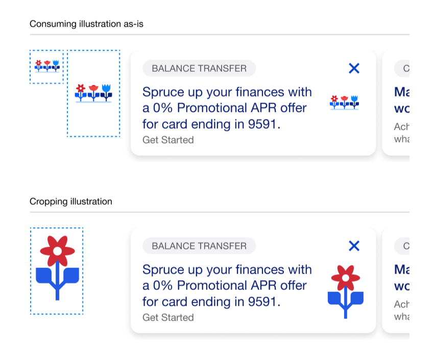
Updates to the branded illustration gallery images to ensure they fit properly within the sales tiles.
Consolidated and socializing the nomenclature for the different atoms of the Tile component, in order to align with the content writers and the marketing teams to ensure that all existing campaign content aligns with the new template standards.
optimizing current campaigns
A/B Testing
List of questions I proposed to researchers during our testing sessions:
Relevance of offers vs goals?
What is the reason for user dismissing card? - User’s thoughts behind Swiping or Dismissing (X)
Do users scroll? and by how many cards? do they click on the last one?
For cards with white background, does Value Proposition entice a tap?
Does adding a background color increase engagement?
Does showing more of the second card make user more interested in seeing more? - on color vs. white background
Does the image mean anything to the user? will they interact similarly without a visible supportive image / background image?
Does pagination save user time? - do they find it useful?