Dashboard Shortcuts
Mobile Banking U.S. Bank
use cases / mobile banking ›
Opportunities
Users were requesting a way for them to access repeated actions without having to necessarily navigate away from their task at hand.
Goals Met:
Increased CSAT (Customer satisfaction)
Increased app engagement
Increased app retention
My role
Performing competitive research
Research analysis of customer’s wants / needs / pain points
Design a proposal for the new component for Shortcuts (Visual/Flows/Micro-interactions)
Analyze customer’s feedback before, during and after making changes
Guide testing along with research team
Define the architecture of the multiple teams involved in each linked shortcut
Work with content team to verify suggested content and Spanish translation
Work wit the accessibility team to test user’s input and to introduce annotations for accessibility (this was a new process at the time for US Bank - it is now ongoing)
Write and socialize guidelines for usage for UX teams, content writers, marketing teams, development teams.
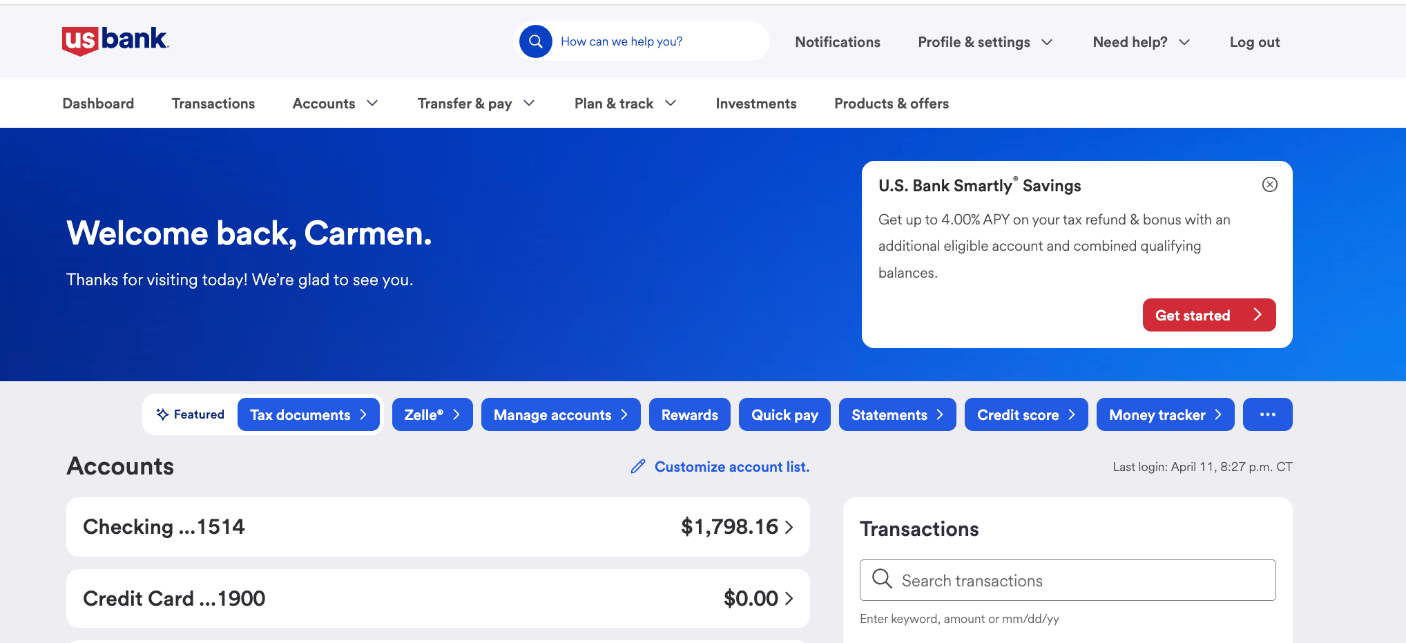
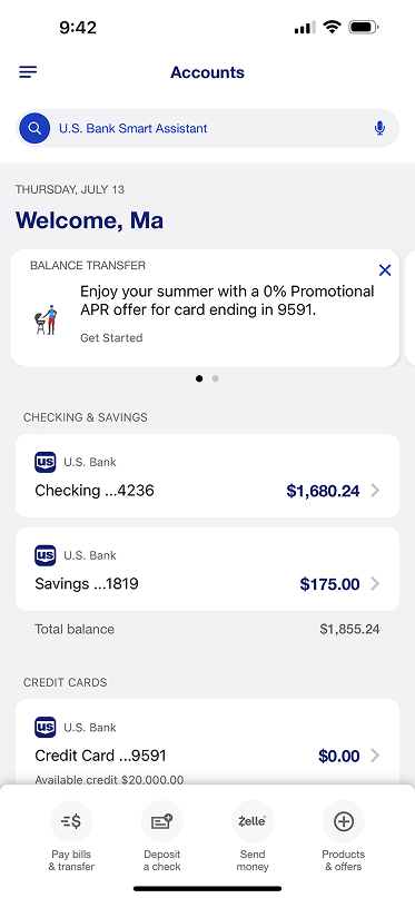
Online Banking - Desktop View
iOS - Prototype shortcuts with Microanimation and Lazy Loading
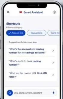
Shortcuts used on Smart Assistant - Ai Voice Assistant
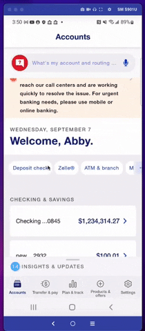
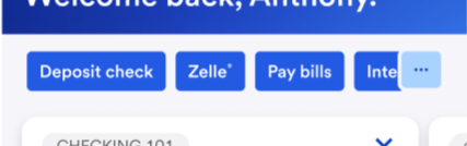
Before shortcuts - iOS
Project Overview (Details)
Key Proposal - Dashboard Shortcuts
A data-driven and customizable group of single-tap links placed on the dashboard to deep link into commonly used actions across the mobile experience.
They allow customers to have access to their frequent tasks done quickly and to customize them as needed.
Shortcuts align with competitor’s apps and if well orchestrated, it will increase customer satisfaction numbers.
Key Optimization Conditional Details
A deep exploration of visual and content improvements to the real state in order to assess impact and achieve set customer’s and business goals.
Items to be addressed in order for the component to be successful:
The Quick Action must link to a consumer- level action deep link (teams should have this link)
or
To an account-level action page for a customer to complete the task at hand.Quick actions cannot substitute for navigation.
Quick actions must lead to a true action or task (not used for advertised products except…).
Quick actions can promote new products, but they need to link to an action within the new product experience.
Users and Audience
Shortcuts with new app redesign
The shortcuts will be visible from customer’s dashboard on their banking app
The marketing team will have access in order to orchestrate availability of the linked pages and they should work with the Content team to follow guidelines for character usage
Developers will need to work with Ai team to define criteria of order of appearance
Proposed Guides of Use
Links placed here should solve for issues with extended number of taps to perform common transactions - therefore a link in this location, must be a direct entrance to the performative action.
Example: Deposit Check should take user to a screen to choose the account (or skip if one account only qualifies) and then start the deposit.
Previously the user needed to 1. scroll to their checking account, 2. tap on it, 3. tap the hamburger menu, 4. tap on account actions, 5.scroll to deposit check.
Scenario A - button with an icon
To give the user time to absorb its purpose - It uses a distinctive look from other elements in the Dashboard - powered by micro-animation, iconography and color to focus visibility and to merge seamless with the rest of the Shortcuts items
Customers are provided with a list of “most recent actions” to appear for the first time it loads, And are given the opportunity to customize and add or remove through more available actions. (Future versions will allow users to custom add them from their different screens on to the dashboard)
On second log in - if untouched, links will remain in place
Redlines - Figma file documented for development and content handoff - iOS and Android
Accessible annotations
Achievements:
I introduced annotations in handoff files - specific to content and modifications from native behaviors when necessary
Slide naming terminology used to explain each element of the component used on the carousel (to align teams)
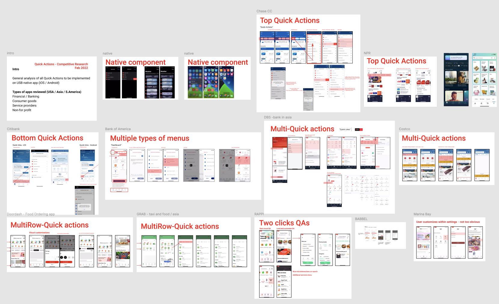
Competitive Analysis
Research of competitors’ use of analog businesses or interfaces was necessary in order to design the best-in-class upgrade to the design,