Mobile Banking U.S. Bank
Sales Tile | Carousel
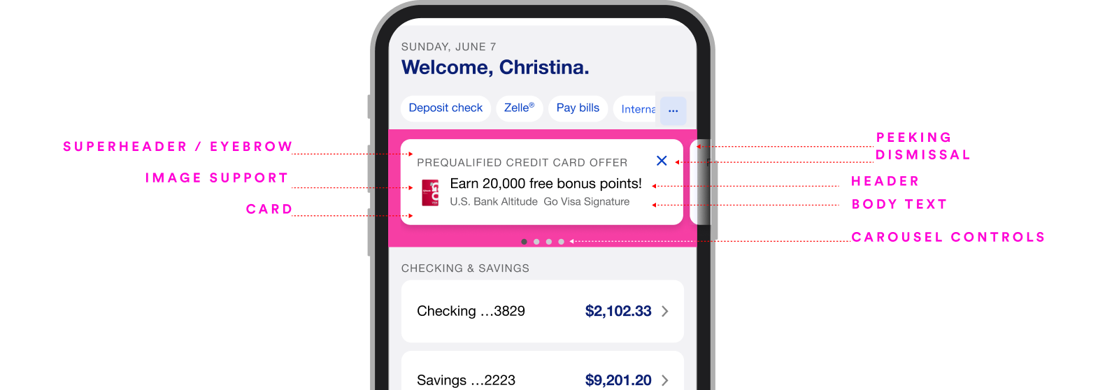
Slide naming terminology used to explain each element of the component used on the carousel (to align teams)
Opportunity for improvements
The accounts dashboard for the customer-facing Banking App is underutilizing prime real state where advertising offers on their “Sales Tile / Carousel“.
Business Goals:
To increase engagement average to ~1.5% (currently average tap/swipe rate keeps on ~1.2%. )
Increase digital active users beyond ~5.3 Million
Have customers enter from the dashboard and access prominent offers by tapping or swiping on the Sales Carousel to explore offers.
Competitive Analysis
To come up with the best in class upgrade to the design, research from competitors’ use of similar businesses or interfaces for a Sales/Promotional tile.
My observations on competitor’s offer placement and how the design is approached:
They lead with content
Show a “peek” view of the next card in carousel
Stand out between from the accounts’ icons, break the left aligned pattern
Work with non-NBA content (Insights, feature awareness, financial education, etc)
Scale to work without graphic support if needed
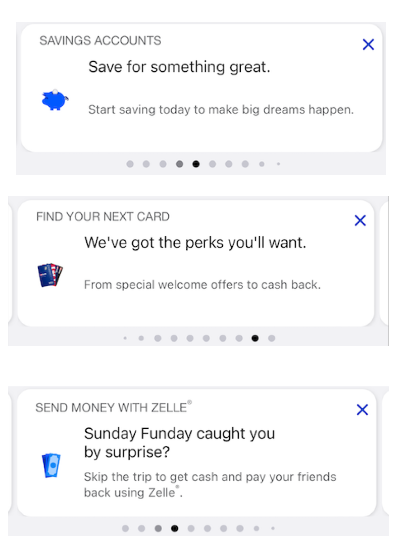
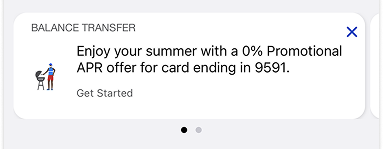
Cards before redesign (Screenshots)
Available insights - Issues addressed
(via data & research)
Users were unclear about the offer value sales offers.
Users were not interacting with additional offers available within the same tappable area (not swiping left to access more cards).
There isn’t data tracking to the access to the offers.
Lacking strategy for offers. (Multiple teams add similar offers to this area)
Lack of content guidelines - Marketing teams are placing content “to fit the space“ instead of “what is easy and quick to understand“ to the user
At time of viewing:
- Digital active users (~5.3 Million)
- Average tap/swipe rate keeps on ~1.2%.
Key Redesign Goal and expected achievements
A deep exploration of visual and content improvements to the real state in order to assess impact and achieve set customer’s and business goals.
My list of gaps to address following the assessment of the component:
Before
Eyebrow: Misaligned in context to the content
“Close” icon: Inconsistent spacing / padding / alignment
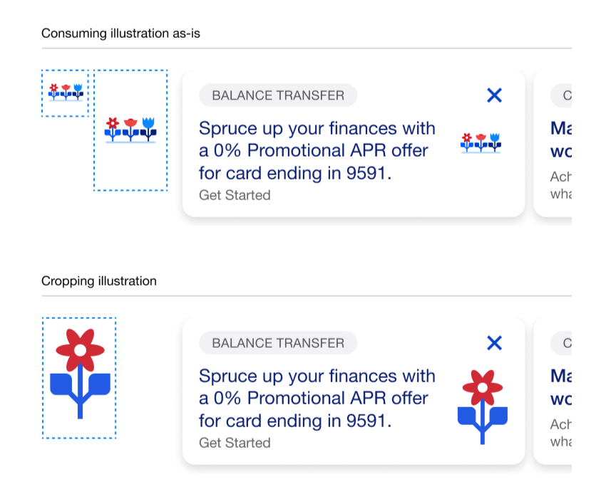
Image: Not optimized to fit in the container / too small
Visual cue: The “next card/next offer” in carousel does not stand out
Call to Action: Not obvious to the user
Auto rotation: Elevate relevant content
Content: Lack of guidelines within eyebrow / header / body
Leverage Ai to test current content against variations and engagement response
Add or connect to a programmatical method (ie: API / analytics) to track interactions and finalized user’s processes
Optimization Detail
the following series of modifications to the offer area, in order to achieve the expected targeted results:
After optimization - Guidelines provided to teams using the Sales Card template
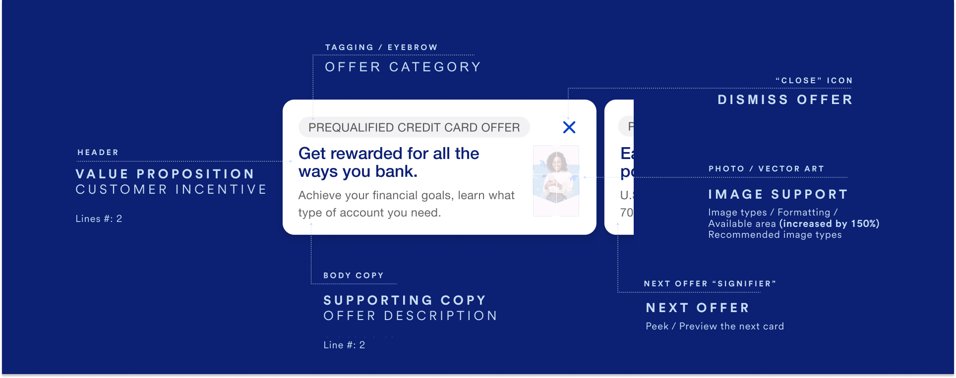
Content hierarchy - increasing relevance for what’s important (ie: eyebrow from header)
Clarity of offers - Content Strategy Guidelines - for usage of eyebrow|callout - Header and body copy
Next card visibility - reducing width of card to allow for next card visibility
Increase tile height without sacrificing significant copy content.
Image support (150% increase) - Swapping location to the right to use the space naturally formed at the end of paragraphs surrounding text
Character count - With support for Spanish translations
Future versions include a way for users to Visualize user’s engagement with sales tile (ellipsis/save icons)
Business goal achievements
Increased Mobile App sales tile impressions by 100% from ~26M to -52M
Increased offer CTR (Click through rate) by 10% (From - 5% to ~.6%)
Tracked every impression (~105M+) to ensure presentation, visibility and actionability.
Findings show that minor Ai driven copy changes improve user’s engagement, - tests are currently ongoing -.
Present campaign optimization
The project also included the optimization of present campaigns to ensure compatibility with the new template.
The optimization included:
Updated the illustration gallery images to ensure they fit properly within the sales tiles.
Streamlined the naming terminology for the different parts of the component, in order to
Align with the content writers and the marketing teams at USBank to ensure that all existing campaign content aligned with the new template standards wherever needed.
Research shows that photographs of real people engaged in genuine interactions (lifestyle) can enhance emotional connection and trust, making the product feel more tangible and appealing to potential customers. According to a study by Nielsen, ads featuring real people can increase viewer engagement by 27% compared to those with illustrations, as they evoke a stronger sense of reality and relatability. This increased engagement can lead to higher conversion rates and more effective advertising campaigns.